Wednesday, December 22, 2010

Happy Holidays


Here's this year's Christmas card, created for the most demanding of clients, my wonderful wife.

Merry Christmas and Happy New Year, everyone!

Wednesday, December 8, 2010

Moving Forward


Perhaps the most intimidating words an art director can mutter are "do whatever you want".

Doing whatever you want is pretty much the opposite of what illustration is. Sure there are varying degrees of freedom on any assignment, but usually there is a story or product or service that plays a role in determining, at least to some degree, what the art is going to be.

So I was a little nervous when Darren DiLieto asked me to create some artwork for his site, Hire An Illustrator, and told me I had free reign to do whatever I felt like. Unlike personal work, this was actually going to be seen by people and used. There would be no burying it if it was a total disaster.

At the same time, its also really cool to have someone put their faith in you to create whatever you want, knowing that the results will be good. So the fear subsided and excitement took over.

I picked up my sketchbook and returned to some earlier, half developed ideas that I had on how the future sucked. How we lacked all the wonderful things promised by Popular Mechanics and assorted futurists in the 1950s. The sort of things I had come up with while working on this. The jet pack seemed to be one of those things that never materialized. How nice it would be to fly into Manhattan from Brooklyn without sitting in traffic or waiting for the train like the some 19th Century man. It's 2010 we should have jet packs by now. That thinking inspired the sketch that turned into the image above.

Of course as I finished this up, I saw this. Maybe there's hope for the future after all.

Monday, November 29, 2010

Summer School


When you're working as an illustrator sometimes you are asked to create work pretty quickly. It's not unheard of to be get a call at noon and have to turn in work by 4 p.m. so it can be printed that evening morning.

Other times, the process moves along much slower.

Way back in the summer of ’09, I was contacted by Nicole Weinbrom from Fordham University. She was interested in seeing some additional samples of my work. I gathered some work together and fired it off. I didn't here from her and quickly forgot about our brief interaction. It was a strange summer. One in which I received many inquiries about my work, but only a fraction turned into actual commissions. The bottoming out economy might have had something to do with that.

Earlier this summer, while in Barcelona on my honeymoon, I was contacted by Nicole's boss Maggie Coyne. They were interested in having me create artwork to be used on the university's 2011 Summer Session course guide as well as some other promotional material. They gave me a great deal of freedom on this project. All they needed was something that said Summer, New York City and Education.

So after spending two weeks with my wife in Spain it was time to get reacquainted with my old friend, the drafting table. Here's what I came up with:


My first idea was to have a street scene with the NYC skyline in the background. The chracters in the background all would have been representative of various career paths related to the summer session's programs. This one had a little too much going on and lacked focus.

Next, I came up with this girl reading stretched out on the Brooklyn Bridge. This said summer and New York, but didn't really hint at any of Fordham's summer programs. There was something about the scale of the girl to the city though that I kind of liked.

This was a simpler idea that, unbeknownst to me, was too similar too art that had been used a few years earlier.
Who doesn't love a lazy river? This was an idea turning the East River into a lazy river. And really, who wouldn't want to float around reading in the East River or Hudson River on a 100ยบ day? This idea was rejected, but the merging of the cityscape and objects from the classroom was well received.

Finally, I married up the two ideas that were working, the oversized figure and classroom objects mixed into the cityscape to create this sketch. This required some minor adjustments, like giving the girl a ponytail to make her look younger and making her sit Indian style, but as you can see became the final art.

And with that a job that started to take shape in June of 2009 was published in November 2010.

Friday, November 19, 2010

Rejected by The New Yorker


The holidays are rapidly approaching. I thought the image above might make a nice early December cover.

I was wrong. Rejected, once again.


If there is another New York-centric publication that needs a Christmas image or someone looking for a custom Christmas card, let me know, it's available.

UPDATE: I've got prints for sale here as well as iPod and iPhone cases here. Working on finding a place to make greeting cards available.

Tuesday, November 9, 2010

Australian For Beer


Back in the waning days of August, I was contacted by Ross Gales from Pollen Digital in Sydney, Australia. He was interestd in commissioning a series of illustrations for a redesign of Cascade Brewery's website. Cascade is the oldest brewer in Australia, so he was looking for artwork with a retro feel.

I created icons for the homepage that led to sections of the website highlighting Cascade's products, brewing process, brewery tour and homebrew options.

After completing those, I was asked to create art for a few banners that would promoted the company's iPhone app. Those can be seen below:


The new website, which debuted last week, can be seen here.

This was a fun project to work on, despite the late nights and early mornings necessitated by working with a client in a timezone 14 hours away. Now I need to find a place in Brooklyn that sells or serves any of Cascades beers so I can taste them. Unfortunately, I didn't get a free sample. I think that should be a requirement for alcohol- and/or food-related projects.

Monday, November 8, 2010

The Marathon

That's me in the center, in Central Park with about a mile and a half to go, and out of gas.

Yesterday, I ran my second marathon.

The first was four years ago. At the time, I knew I'd run another. I didn't think it would take four years to do it. Things didn't turn out the way I planned.

In 2007, I was training to run New York and injured my foot a month before the race and couldn't run.

In 2008, history repeated itself. I was planning on running the Providence Marathon with my friend (and eventual winner) Blaine. I re-injured my foot three weeks before the race.

I took some time off after the second injury. When I started running again, I felt really out of shape. The more I tried to run the worse I felt. Only after I started having vision problems did I go to the doctor. It turned out the lack of energy and vision problems were related. As it turned out, I had leukemia. Running was out of the question for the immediate future.

In March, I woke up one morning, felt good wanted to run. I hadn't felt that way in almost two years. I kept running. After a few weeks, I decided I wanted to run the marathon again. I signed up with Team In Training, which given my condition seemed appropriate.

This time, I made it back to the starting line. 2 hours, 57 minutes and 34 seconds later I reached the finish. 705th out of 44,829 finishers. Not too bad.

None of this would have been possible without the support of terrific friends and family, as well as the kindness of some strangers. Together we raised over $6,500 for the Leukemia and Lymphoma Society.

Thank you!

Wednesday, September 15, 2010

For The Record, Kids Today Are Growing Up Too Fast


Here's a recent, quick-turnaround job for my old friends at The Record.

The story looks at girls reaching puberty earlier than ever before, some as young as eight- or nine-years-of-age. No one is entirely sure what has caused this shift in development. There is believed to be a link between obesity. Others suspect it might be from the hormones injected into livestock that eventually enters the food chain.

There are short- and long-term problems associated with maturing physically too soon. These girls are at often the targets of bullying (She's different, let's all make fun of her!) and misplaced expectations from their peers and teachers (Why isn't she acting as mature as she looks?). They also have a higher risk of cancer later in life.

The full story can be read here.

A thank you goes out to AME/Graphics and Design Jerry Luciani and Deputy Graphics Editor R.L. Rebach for thinking of me for this project.

Monday, August 16, 2010

Running For A Cure


This fall I will be participating in the New York City Marathon as a member of Team In Training. I'm hoping to run under 3 hours, a little over a year after being diagnosed with Chronic Myelogenus Leukemia.

All of us on Team In Training are raising funds to help stop leukemia, lymphoma, Hodgkin lymphoma and myeloma from taking more lives. We need your support to cross the ultimate finish line - a cure.

This Thursday, August 19, my wife and I will be hosting a happy-hour, fundraising event.

Please join us from 6-9 p.m. at Affair on Eighth, 35 West 8th Street (between Sixth Ave. and MacDougal St.) New York, NY. $40 gets you unlimited happy hour specials and helps make a difference in the fight against blood cancers.

Thursday, August 5, 2010

Lion in the Sun


A few months ago, I created a Brooklyn Bridge themed invitation for my wedding. I'm pleased to announce that image is now available for your invitations and stationary at Lion in the Sun.

Lion in the Sun is a full service paperie located in Park Slope, Brooklyn specializing in unique custom invitations for every occasion. They have a terrific selection on Brooklyn-centric and New York-themed designs. They have a wonderful staff that helps turn out some sophisticated and well-designed products.

Check them out if you find yourself in Brooklyn and/or are in need of invitations.

Wednesday, August 4, 2010

Picking a Winner


Here's a recent spot illo I worked on for Barron's. (Full disclosure: I work there as a graphic designer in the art department.) The art ran with a story ranking the best (and worst) stock brokers over the previous 6 months, 1-year, 3-years and 5-years. In other words, which firms have done the best job picking winners. Art director was Diane Sipprelle.

This was an initial sketch that focused more on a happy and unhappy bettor. Here the decision was made to focus on just the horses.
Two more options, they went with the latter.

Tuesday, August 3, 2010

The New Mrs. Tomac


It's been a while since my last update and with good reason. I got married. Since the wedding and honeymoon, I've been fairly busy with new work, some of which I'll be showing off here in the near future.

Photo by the awesome Erica Lyn.

Monday, June 21, 2010

Buy Art, Support a Great Cause


On September 22, 2009 I was diagnosed with chronic myelogenous leukemia.

Nine months later, I'm feeling a lot better. So much so that I'm planning running the New York City Marathon this fall to help raise money for Leukemia and Lymphoma Society and their relentless pursuit of a cure for blood cancers.

To help meet my fundraising goals, I will be donating 100% of my profits from my imagekind shop to this worthy cause until November 7.

You get art for your wall, the world gets closer to a cure for leukemia and lymphoma. I can't think of a better combination.

Visit johnwtomac.imagekind.com buy art and know that a sizable portion of your purchase price will go to charity.

If you don't have enough room on your walls for art you can support my efforts at beatcancer.johnwtomac.com

And if you see something here or here that's not for sale, contact me and I'll make it available, as long as I have the rights to do so.

Tuesday, June 15, 2010

New to Chico? There's an app for that


This week, the class of 2014 will begin showing up at California State University at Chico for freshman orientation. The Chico News & Review has put together a special edition for the occasion. It is filled with useful information for those new to the area.

I was contacted by art director Tina Flynn to illustrate the cover. For this project, she wanted to show a smartphone screen with Chico-centric apps. The challenge was figuring out how to fit a narrow device in a more square-shaped space.

I played around with a few variations.
Phone with glow around it.
Phone flying forward.
Phone on the ground. I envisioned a glow emenating from the screen lighting up the nameplate.

Ultimately, the decision was made to go with a device that had similar proportions to the page.

At this stage the editors were still a bit undecided on some of the apps, since the wider proportion gave them a chance to create a few more.

Eventually we figured out all 12 and the app icons were reused on the inside with a feature highlighting things to do in Chico.

Wednesday, June 9, 2010

U.S. Against the World

This is another job for The Record, Northern New Jersey's daily newspaper.

Shortly after finishing up my last assignment for them, the gentlemen who run the art department there, Jerry Luciani and Bob Rebach asked if I would illustrate the cover of the paper's World Cup Preview.

The section was going to be a tabloid despite the papers normal broadsheet publishing format. That meant, I'd have a squarish sort of space to work with. and would need to work in the section nameplate in the top left corner and leave space for a headline The working headline I got was U.S. against the World.

Here are the initial sketches I put together:
Goalkeeper diving to stop a ball, which looks like a globe. U.S. stopping the world

Here's a player bending it around the world toward a goal suggesting the U.S. finally getting by some of the World's biggest teams

The thinking here was more a United Front ready to take on the world.

Kicking a ball from a new position in the soccer world, near the top. We're not a third-rate soccer country anymore
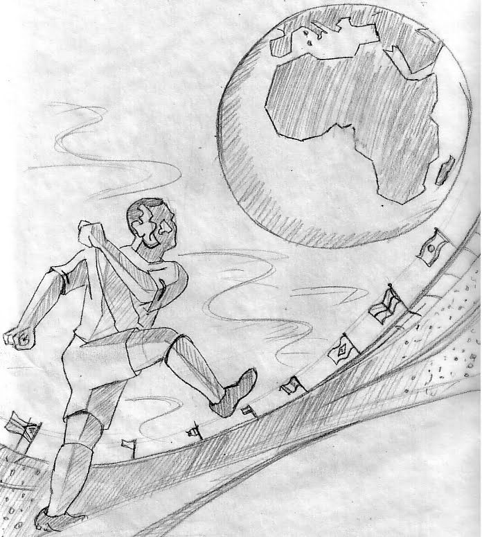
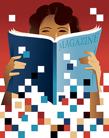
Jerry liked what was going on in that last sketch near the top, but thought that the player should be bigger and kicking the globe. Happy to oblige, I worked up this and was off to the finish.

Monday, May 24, 2010

For The Record, Not Everyone Loves Your Pets


A couple of week's ago, I was contacted by my old friends at The Record to illustrate a feature for the front of their weekly Real Estate section.

The story looked at the challenges pet owners face when trying to sell their homes. In the current market, animal dander, minor pet damage or even signs a pet lives in the house can turn off prospective buyers. Similarly, realtors aren't always prepared to show houses with animals inside. That can lead to a situation where agents are shocked to find the owner's large dogs wandering the house or cats are accidentally let out of the house.

The layout called for a more horizontal image because half of the page was going to occupied by an advertisement. Here are some of the sketches:


This was based on the author and editor's suggestion. The idea was to incorporate as much imagery from the rough draft as possible: realtor letting the cat out, dog on furniture, turtles in bathroom, notes around the house warning about the animals...


Here's the image that was picked. I thought having the cat and dog on the couch would suggest animals that had the run of the house, which seemed to be the basis for the problems sellers and realtors were encountering.


Here's another idea; the dog is the feature of the house for sale that really jumps out at you.

Monday, May 3, 2010

Showing Some Skin


I'm happy to announce that the iPhone and iPod Touch skin pictured above is now available through Society 6.

The skin is thin, easy-to-remove, vinyl decals for customizing your mobile phone. It is made from a patented 3M material that eliminates air bubbles for easy application.

Now I feel kind of bad for badmouthing iPods.

Thursday, April 29, 2010

Working with a very demanding client

No, this isn't a story about a client from hell.

It's a story about someone who knew what they wanted...and will soon be my wife.

At the end of 2008, I got engaged to a wonderful girl named Mary. As winter turned into spring, the euphoria of OMG! I'm getting married! shifted to OMG! We have a lot of planning to do!

In those initial discussion of what we needed to do, I said, "I can take care of the invitations" I figured I was qualified to do so, having done a little work in the field of illustration and graphic design.

Mary wanted me to start working on them right away. As soon as we had a date set I would start getting routinely questioned about when I was going to start working on the invitations. My response was always soon enough. The last thing I wanted to do was create something that was initially loved then fell out of favor over time. I know that I'm somewhat critical of my own work and start picking it apart when I go back and look at it months after the fact. I didn't want both of us to be picking apart the invitations when the time came to send them out. I also didn't want everyone to see them before they were sent out.
So, I engaged in what I'll call strategic procrastination.

Mary was also upfront about things she didn't want. She assured she didn't want to offend me but said that my work could be "cold" and "forceful" and "industrial-looking" and that she didn't want the invitations to have those qualities. She wanted something a little more romantic.

She also wanted the Brooklyn Bridge.

I proposed on the bridge and our reception venue is right in the shadow of the Roeblings' masterpiece, so the landmark had some significance in our relationship. I had no problem coming up with a Brooklyn Bridge image in the past, so I didn't object.

The other thing she wanted was yellow. Its her favorite color and she's having a yellow wedding. Yellow, can be a tricky color to work with, especially if you are planning on reversing type out of it. I'm sure those who remember the early days of the internet recall the awful white and yellow web pages.

With those things in mind, I put together a rough design that looked like this:


Mary was very pleased with this was heading, so we headed over to Lion In The Sun, a local stationary store specializing in invitations to discuss our printing options. It was here that Mary got to see firsthand how great letterpress invites could look. Thankfully, they weren't priced out of our budget. With the decision made to go with the letterpress, my all-yellow invite design wasn't going to cut it any more.

In the redesign process, I added a little more detail to the bridge to break up the large swath of solid color. We also made the decision to print in gold and blue. The gold was chosen because the yellow inks that were available probably wouldn't have reproduced all that well on the paper stock that we chose. We did, however, choose some yellow envelopes that looked very nice with the final printed piece. I also created a reply card that we would reverse letterpress in blue. (Blue is the secondary color in our palette.)

And here's the final product.


Needless to say the bride-to-be is very happy with the results.

And as luck would have it, so was the printer. I should have some news about the availability of this design after our wedding.

I should also mention if there is anyone out there looking for custom wedding invitations feel free to get in touch with me.

Thursday, April 1, 2010

Salvation for Print


Print to Pixels, originally for Folio:

The iPad is coming.

It brings with it the opportunity to rescue print, or at the very least the companies that currently publish newspapers, magazines and books.

The new platform offers a pretty cool opportunity for publishers to create a product that combines the interactivity of the web and the narrative nature of the printed page.

Presumably, the user would be able to download an application or an individual copy through iTunes and begin reading right away.

If that's the case media companies have an opportunity to make a ton of money.

Traditionally, production and distribution of printed materials have been one of the biggest expenditures. Some of those costs were recouped by subscriptions and individual copy sales.

However, in the age of the internet people started reading content for free online and stopped paying for news. Leaving distrbution costs to be paid by a smaller audience and declining ad rates that were tied to circulation.

The transition from print to pixels could save magazines and newspapers that were left for dead. They have an opportunity to shed their 20th century distribution network and again get people paying for news.

The challenge now becomes producing enough interesting content to keep readers engaged. The internet and TV aren't across the room anymore, they're on the same device.

The only way of doing that is hiring lots of good writers, editors, designers and artists

Wednesday, March 31, 2010

Just Another Training Tool?


Apparently, my last post on running with headphones touched a nerve with some other runners. There are plenty of runners who listen to music while training and a few added their two cents.

Reuben Morley pointed out:

...The fact is, some people prefer running with music while others don’t. As long as your sensible there is no right or wrong choice. Music can act as motivation, inspiration or simply a distraction to get the job done (this does not mean we as runners are unaware of our surroundings)

For people like me who train a lot, music can break the repetiveness of running and make it more enjoyable.

As I said, in my opinion, there is no right or wrong choice when it comes to music. As long the runner is precautious and sensible, they should be fine. I love music and I love running. For more than 600 miles they’ve gone hand in hand perfectly. They won’t be getting split up any time soon. iRun to the beat.

I certainly don't want to begrudge anyone who is making an effort to get out and exercise. There are certainly worse things you could be doing than donning the headphones.

However, it still seems like a needlessly risky activity kind of like texting or talking on the phone while driving.

John Fenton shared his approach to make it a little more safe:

...I only wear my headphones when running on closed-access paved trails or on the treadmill. I don't wear them on roads or sidewalks. I don't wear them on real trails. And, on top of that, I don't wear them during most workouts.


...I also keep the volume at a reasonable level. Almost without fail, I can hear cyclists coming up behind me before they pass.

It's getting warm so there are going to be a lot more runners taking to the streets. If you're one of them, regardless of whether you have headphones or not, be safe.

I'll be out there training for the New York City Marathon, and raising some money for the Leukemia so say hello if you see me.

Tuesday, March 23, 2010

iGnoring Yourself and the World Around You


This past weekend I had the chance to watch a little bit of the NYC Half Marathon. I was blown away by the number of runners with iPods. I've run thousands of miles in my life and wouldn't need all the fingers on one hand to count the times I've run with headphones.

There are really only two reasons why I shun the portable music devices – they screw up your training and they're dangerous. (a view I share with my friend Blaine, who also happens to be a pretty good coach.)

There have been a studies linking listening to music and performance while running. The studies say pretty much the same thing – When you've got your iPod on, your pace will sync up with the tempo of your music. If the music picks up the pace, so will you. However, when the music slows down so do you.

Your body will tell you all sorts of things when you are running, you just have to listen. Heart rate, breathing, muscle response all give valuable clues as to how we are running, whether our pace is too fast or slow or if a discomfort is temporary or something more serious. When you have your headphones on you ignore these messages and run to match the beat of your music. That can lead to overtraining which causes injury or burnout.

Unfortunately, that's not the real danger to running with you iPod.

Runners with headphones tend to be oblivious to the world around them. While the dangers are probably limited to bumping into another runner or missing a turn on a closed road race course, most of us run in the roads between races.

You don't own the road. You're sharing it with drivers and cyclists. A runner involved in a collision with a car is going to lose every single time. Getting hit by a bicycle isn't much fun either, for the runner or the guy on his bike.

It is in the best interest of runners to be able to hear cars and bikes approaching. There is plenty of time to get out of the way when you hear a car coming. Of course, you have to hear it first. You're a lot less likely to hear someone coming if you're rocking out to your mp3 player.

Just last week I witnessed a runner with headphones head full speed into a busy intersection against the light and right in front of a car. Luckily the car stopped, but I'm convinced that had she not had her ears plugged she probably would have heard the cars coming, looked and stopped instead of being startled by a car coming to a screeching halt.

Because I'm probably starting to sound like an old crumudgeon, I'll cut my ranting and raving short. But for your training's sake and your safety's sake leave the headphones at home the next time you go for a run. Trust me it won't be that hard. You might even find the soundtrack provided by the city and mother nature quite enjoyable.

You'll also have an opportunity to learn the age-old lesson that running teaches us:
The challenge in front of me can be completed one step at a time.

You won't learn that lesson when you're zoning out, running with your iPod.

Friday, March 19, 2010

White House Seeks Artists' Comments to Improve Copyright Protection

From the Illustrators Partnership

New Copyright Czar begins Joint Strategic Plan to Protect Intellectual Property.
Victoria Espinel is the first U.S. Intellectual Property Enforcement Coordinator (IPEC), also known as the Copyright Czar. Congress created IPEC by an Act of Congress. Ms. Espinel serves within the Executive Office of the President to coordinate with all the federal agencies that fight the infringement of intellectual property.

Ms. Espinel and her team are specifically tasked with formulating and implementing a Joint Strategic Plan to help protect the ingenuity and creativity of Americans by improving the U.S. Government's protection of the rights of intellectual property owners.

Your input is requested.
The White House is inviting your public input and participation to shape an effective intellectual property enforcement strategy. Please respond with your written submissions regarding the costs to you, your business and the U.S. economy resulting from infringement of your intellectual property rights, both direct and indirect.

This will be a 2-part process.
The first is to gather public recommendations by March 24. IPEC will then gather your input on the formulated plan.

Please be precise.
Include your name, city, state, and what type of artist you are. Explain why copyright is critical to you as a commercial artist, how infringement affects you, and what the U.S. government can do to better protect the rights of American artists. If your submission is about your economic loss due to infringement of your copyrights you must clearly identify the methodology used to calculate your losses or otherwise validate your infringement and enforcement costs.

Your submission will be publicly posted.

For this reason, please do not include in your comments information of a confidential nature, such as sensitive personal information or proprietary information.

Confidential disclosures.

If you have confidential business information that would support your recommendation or that you believe would help the Government formulate an effective enforcement strategy, please let them know by contacting:
Thomas L. Stoll
Office of the Intellectual Property Enforcement Coordinator
(202) 395-1808

Deadline: Submissions must be received by Wednesday, March 24, 2010, at 5 p.m. EST.
All submissions should be sent electronically via intellectualproperty@omb.eop.gov

More backrgound information is available here.

For news and information, and an archive of these messages visit the Illustrators' Partnership Orphan Works Blog

Tuesday, March 9, 2010

Tweet Tweet

All the cool kids are doing it and now so am I.

Follow me at twitter.com/johnwtomac

(that's less than 140 characters, right?)

UFOs in Brooklyn


UFOs have been spotted over Brooklyn.

Are they aliens from another planet? If so, Why are they here?

Did they come for the bagels? The music scene? To visit their grandmothers?

Or were priced out of Manhattan?