
Tuesday, March 8, 2011
Blog update
I'm now blogging at johnwtomac.com/blog Please update your bookmarks. I look forward to seeing you at the new site.

Monday, February 7, 2011
Attention ETF Shoppers

Here’s another quick-turnaround, spot illustration for Barron’s. This week the subject is Exchange Traded Funds. This particular story looks at one research firm’s evaluation system that may take away the guesswork out of choosing an ETF based on certain objectives.
Monday, January 31, 2011
Strong Like Bull

Monday, January 10, 2011
Movin' Out
After three years in Park Slope, the wife and I are moving a few miles down Fourth Ave to Bay Ridge.
While we are getting settled, I will be unavailable for commissions with shorter deadlines until Wed., Jan. 19.
Until then, the best way to get in touch with me is via e-mail at john@johnwtomac.com. I can also be reached on my cell phone, (607) 280-7016.
Thanks for your understanding. I look forward to working with you soon.
While we are getting settled, I will be unavailable for commissions with shorter deadlines until Wed., Jan. 19.
Until then, the best way to get in touch with me is via e-mail at john@johnwtomac.com. I can also be reached on my cell phone, (607) 280-7016.
Thanks for your understanding. I look forward to working with you soon.
Tuesday, January 4, 2011
The Road to the Super Bowl

With the NFL Playoffs starting this weekend, this seems like a good time to share a recently completed project for the Dallas Observer
In early December, I was contacted by the alt weekly's extremely talented, art director Alexander Flores. He had an idea for a pin-up and art deco-inspired image for both a rack card and cover for a special guide being produced for "The Big Game" coming to town in February. He had just received on of my postcards and thought I'd be perfect for the job.
Alexander was kind enough to pass along a few images for inspiration, like this, this and this, as well as a thumbnail sketch, seen below.

I proceeded to a tighter version...

...which was tweaked a little more before heading on to the final.

This was a fun project to work on and at times it felt like Alex and I were thinking with the same brain. I hope to have the pleasure of working with him again.
Oh, and while we're on the topic of football, one more thing.
Wednesday, December 22, 2010
Happy Holidays

Here's this year's Christmas card, created for the most demanding of clients, my wonderful wife.
Merry Christmas and Happy New Year, everyone!
Wednesday, December 8, 2010
Moving Forward

Perhaps the most intimidating words an art director can mutter are "do whatever you want".
Doing whatever you want is pretty much the opposite of what illustration is. Sure there are varying degrees of freedom on any assignment, but usually there is a story or product or service that plays a role in determining, at least to some degree, what the art is going to be.
So I was a little nervous when Darren DiLieto asked me to create some artwork for his site, Hire An Illustrator, and told me I had free reign to do whatever I felt like. Unlike personal work, this was actually going to be seen by people and used. There would be no burying it if it was a total disaster.
At the same time, its also really cool to have someone put their faith in you to create whatever you want, knowing that the results will be good. So the fear subsided and excitement took over.
I picked up my sketchbook and returned to some earlier, half developed ideas that I had on how the future sucked. How we lacked all the wonderful things promised by Popular Mechanics and assorted futurists in the 1950s. The sort of things I had come up with while working on this. The jet pack seemed to be one of those things that never materialized. How nice it would be to fly into Manhattan from Brooklyn without sitting in traffic or waiting for the train like the some 19th Century man. It's 2010 we should have jet packs by now. That thinking inspired the sketch that turned into the image above.
Of course as I finished this up, I saw this. Maybe there's hope for the future after all.
Monday, November 29, 2010
Summer School

When you're working as an illustrator sometimes you are asked to create work pretty quickly. It's not unheard of to be get a call at noon and have to turn in work by 4 p.m. so it can be printed that evening morning.
Other times, the process moves along much slower.
Way back in the summer of ’09, I was contacted by Nicole Weinbrom from Fordham University. She was interested in seeing some additional samples of my work. I gathered some work together and fired it off. I didn't here from her and quickly forgot about our brief interaction. It was a strange summer. One in which I received many inquiries about my work, but only a fraction turned into actual commissions. The bottoming out economy might have had something to do with that.
Earlier this summer, while in Barcelona on my honeymoon, I was contacted by Nicole's boss Maggie Coyne. They were interested in having me create artwork to be used on the university's 2011 Summer Session course guide as well as some other promotional material. They gave me a great deal of freedom on this project. All they needed was something that said Summer, New York City and Education.
So after spending two weeks with my wife in Spain it was time to get reacquainted with my old friend, the drafting table. Here's what I came up with:

My first idea was to have a street scene with the NYC skyline in the background. The chracters in the background all would have been representative of various career paths related to the summer session's programs. This one had a little too much going on and lacked focus.


And with that a job that started to take shape in June of 2009 was published in November 2010.
Friday, November 19, 2010
Rejected by The New Yorker

The holidays are rapidly approaching. I thought the image above might make a nice early December cover.
I was wrong. Rejected, once again.

If there is another New York-centric publication that needs a Christmas image or someone looking for a custom Christmas card, let me know, it's available.
UPDATE: I've got prints for sale here as well as iPod and iPhone cases here. Working on finding a place to make greeting cards available.
Tuesday, November 9, 2010
Australian For Beer

Back in the waning days of August, I was contacted by Ross Gales from Pollen Digital in Sydney, Australia. He was interestd in commissioning a series of illustrations for a redesign of Cascade Brewery's website. Cascade is the oldest brewer in Australia, so he was looking for artwork with a retro feel.
I created icons for the homepage that led to sections of the website highlighting Cascade's products, brewing process, brewery tour and homebrew options.
After completing those, I was asked to create art for a few banners that would promoted the company's iPhone app. Those can be seen below:


The new website, which debuted last week, can be seen here.
This was a fun project to work on, despite the late nights and early mornings necessitated by working with a client in a timezone 14 hours away. Now I need to find a place in Brooklyn that sells or serves any of Cascades beers so I can taste them. Unfortunately, I didn't get a free sample. I think that should be a requirement for alcohol- and/or food-related projects.
Monday, November 8, 2010
The Marathon

That's me in the center, in Central Park with about a mile and a half to go, and out of gas.
Yesterday, I ran my second marathon.
The first was four years ago. At the time, I knew I'd run another. I didn't think it would take four years to do it. Things didn't turn out the way I planned.
In 2007, I was training to run New York and injured my foot a month before the race and couldn't run.
In 2008, history repeated itself. I was planning on running the Providence Marathon with my friend (and eventual winner) Blaine. I re-injured my foot three weeks before the race.
I took some time off after the second injury. When I started running again, I felt really out of shape. The more I tried to run the worse I felt. Only after I started having vision problems did I go to the doctor. It turned out the lack of energy and vision problems were related. As it turned out, I had leukemia. Running was out of the question for the immediate future.
In March, I woke up one morning, felt good wanted to run. I hadn't felt that way in almost two years. I kept running. After a few weeks, I decided I wanted to run the marathon again. I signed up with Team In Training, which given my condition seemed appropriate.
This time, I made it back to the starting line. 2 hours, 57 minutes and 34 seconds later I reached the finish. 705th out of 44,829 finishers. Not too bad.

None of this would have been possible without the support of terrific friends and family, as well as the kindness of some strangers. Together we raised over $6,500 for the Leukemia and Lymphoma Society.
Thank you!
Wednesday, September 15, 2010
For The Record, Kids Today Are Growing Up Too Fast

Here's a recent, quick-turnaround job for my old friends at The Record.
The story looks at girls reaching puberty earlier than ever before, some as young as eight- or nine-years-of-age. No one is entirely sure what has caused this shift in development. There is believed to be a link between obesity. Others suspect it might be from the hormones injected into livestock that eventually enters the food chain.
There are short- and long-term problems associated with maturing physically too soon. These girls are at often the targets of bullying (She's different, let's all make fun of her!) and misplaced expectations from their peers and teachers (Why isn't she acting as mature as she looks?). They also have a higher risk of cancer later in life.
The full story can be read here.
A thank you goes out to AME/Graphics and Design Jerry Luciani and Deputy Graphics Editor R.L. Rebach for thinking of me for this project.
Monday, August 16, 2010
Running For A Cure

This fall I will be participating in the New York City Marathon as a member of Team In Training. I'm hoping to run under 3 hours, a little over a year after being diagnosed with Chronic Myelogenus Leukemia.
All of us on Team In Training are raising funds to help stop leukemia, lymphoma, Hodgkin lymphoma and myeloma from taking more lives. We need your support to cross the ultimate finish line - a cure.
This Thursday, August 19, my wife and I will be hosting a happy-hour, fundraising event.
Please join us from 6-9 p.m. at Affair on Eighth, 35 West 8th Street (between Sixth Ave. and MacDougal St.) New York, NY. $40 gets you unlimited happy hour specials and helps make a difference in the fight against blood cancers.
Thursday, August 5, 2010
Lion in the Sun

Lion in the Sun is a full service paperie located in Park Slope, Brooklyn specializing in unique custom invitations for every occasion. They have a terrific selection on Brooklyn-centric and New York-themed designs. They have a wonderful staff that helps turn out some sophisticated and well-designed products.
Check them out if you find yourself in Brooklyn and/or are in need of invitations.
Wednesday, August 4, 2010
Picking a Winner

Here's a recent spot illo I worked on for Barron's. (Full disclosure: I work there as a graphic designer in the art department.) The art ran with a story ranking the best (and worst) stock brokers over the previous 6 months, 1-year, 3-years and 5-years. In other words, which firms have done the best job picking winners. Art director was Diane Sipprelle.


Tuesday, August 3, 2010
The New Mrs. Tomac

It's been a while since my last update and with good reason. I got married. Since the wedding and honeymoon, I've been fairly busy with new work, some of which I'll be showing off here in the near future.
Photo by the awesome Erica Lyn.
Monday, June 21, 2010
Buy Art, Support a Great Cause

On September 22, 2009 I was diagnosed with chronic myelogenous leukemia.
Nine months later, I'm feeling a lot better. So much so that I'm planning running the New York City Marathon this fall to help raise money for Leukemia and Lymphoma Society and their relentless pursuit of a cure for blood cancers.
To help meet my fundraising goals, I will be donating 100% of my profits from my imagekind shop to this worthy cause until November 7.
You get art for your wall, the world gets closer to a cure for leukemia and lymphoma. I can't think of a better combination.
Visit johnwtomac.imagekind.com buy art and know that a sizable portion of your purchase price will go to charity.
If you don't have enough room on your walls for art you can support my efforts at beatcancer.johnwtomac.com
And if you see something here or here that's not for sale, contact me and I'll make it available, as long as I have the rights to do so.
Tuesday, June 15, 2010
New to Chico? There's an app for that

This week, the class of 2014 will begin showing up at California State University at Chico for freshman orientation. The Chico News & Review has put together a special edition for the occasion. It is filled with useful information for those new to the area.
I was contacted by art director Tina Flynn to illustrate the cover. For this project, she wanted to show a smartphone screen with Chico-centric apps. The challenge was figuring out how to fit a narrow device in a more square-shaped space.
I played around with a few variations.
 Phone with glow around it.
 Phone flying forward.
  Phone on the ground. I envisioned a glow emenating from the screen lighting up the nameplate.
 Ultimately, the decision was made to go with a device that had similar proportions to the page.

At this stage the editors were still a bit undecided on some of the apps, since the wider proportion gave them a chance to create a few more.
Eventually we figured out all 12 and the app icons were reused on the inside with a feature highlighting things to do in Chico.

Wednesday, June 9, 2010
U.S. Against the World
 This is another job for The Record, Northern New Jersey's daily newspaper.
 Shortly after finishing up my last assignment for them, the gentlemen who run the art department there, Jerry Luciani and Bob Rebach asked if I would illustrate the cover of the paper's World Cup Preview.
The section was going to be a tabloid despite the papers normal broadsheet publishing format. That meant, I'd have a squarish sort of space to work with. and would need to work in the section nameplate in the top left corner and leave space for a headline The working headline I got was U.S. against the World.
Here are the initial sketches I put together:
 Goalkeeper diving to stop a ball, which looks like a globe. U.S. stopping the world
 Here's a player bending it around the world toward a goal suggesting the U.S. finally getting by some of the World's biggest teams
 The thinking here was more a United Front ready to take on the world.
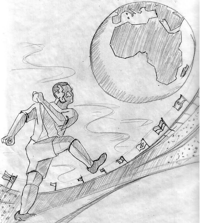
  Kicking a ball from a new position in the soccer world, near the top. We're not a third-rate soccer country anymore
 Jerry liked what was going on in that last sketch near the top, but thought that the player should be bigger and kicking the globe. Happy to oblige, I worked up this and was off to the finish.
Monday, May 24, 2010
For The Record, Not Everyone Loves Your Pets

A couple of week's ago, I was contacted by my old friends at The Record to illustrate a feature for the front of their weekly Real Estate section.
The story looked at the challenges pet owners face when trying to sell their homes. In the current market, animal dander, minor pet damage or even signs a pet lives in the house can turn off prospective buyers. Similarly, realtors aren't always prepared to show houses with animals inside. That can lead to a situation where agents are shocked to find the owner's large dogs wandering the house or cats are accidentally let out of the house.
The layout called for a more horizontal image because half of the page was going to occupied by an advertisement. Here are some of the sketches:

This was based on the author and editor's suggestion. The idea was to incorporate as much imagery from the rough draft as possible: realtor letting the cat out, dog on furniture, turtles in bathroom, notes around the house warning about the animals...

Here's the image that was picked. I thought having the cat and dog on the couch would suggest animals that had the run of the house, which seemed to be the basis for the problems sellers and realtors were encountering.

Here's another idea; the dog is the feature of the house for sale that really jumps out at you.
Subscribe to:
Posts (Atom)